Description
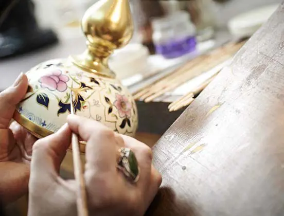
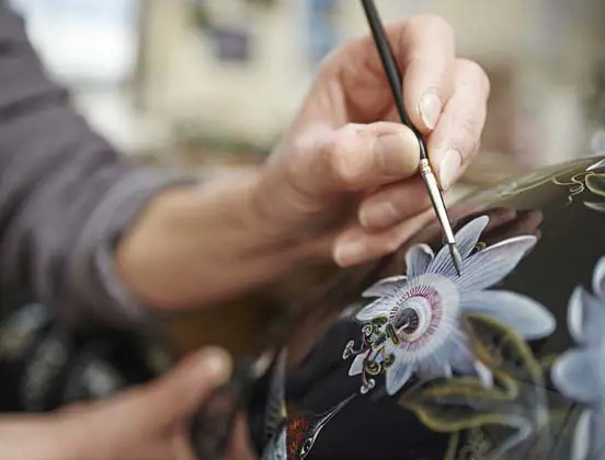
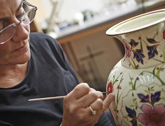
Chamberlain & Co. are manufacturers of the finest bone china and are located in the heart of Worcestershire where there is a long tradition of creating fine ceramic pieces.
When we first spoke to Chamberlain & Co. and ran through our discovery process it became quite evident that this website was going to be totally design led. Long discussions about the target audience, the branding and the printed brochures led to some initial concepts which were predominantly set in black. This looked very good on the printed material that Chamberlain & Co were using at exhibitions, but on screen it wasn’t quite as sharp and didn’t convey the quality, detail and exclusivity required for this product range.
After several false starts using the black theme, we decided to go back to the drawing board and come up with some concepts that we would be happier with; all done without the knowledge of the client.
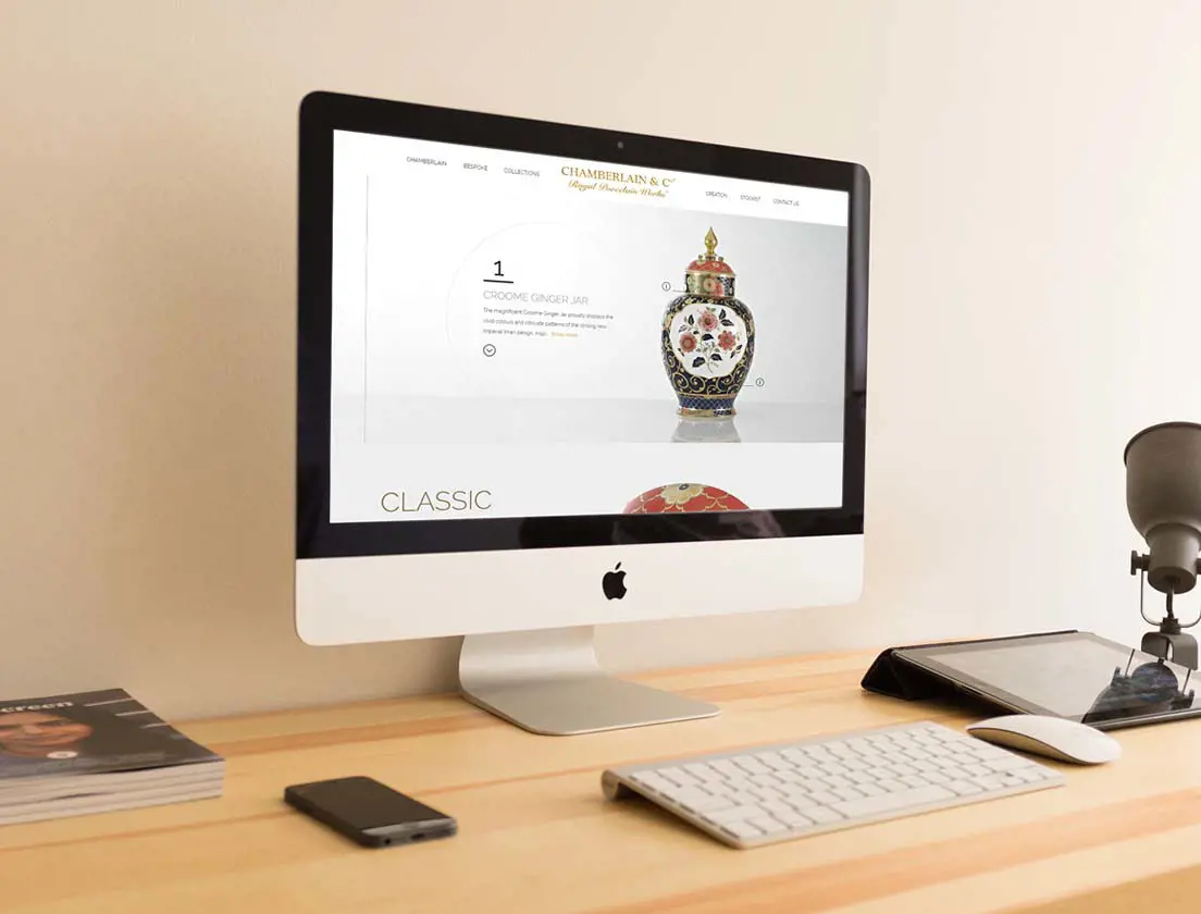
Once we came up with the new gold on white theme, we created several pages to present to the marketing team at Chamberlain. They were instantly taken with the new designs and from there the development of ideas flowed and the resulting website is evidence of the quality of work our graphic designers are capable of when left to their own devices.
We advised on photography of the product and helped align textual copy with the layout of the website. This is so important when portraying the exclusive nature of such valuable items.
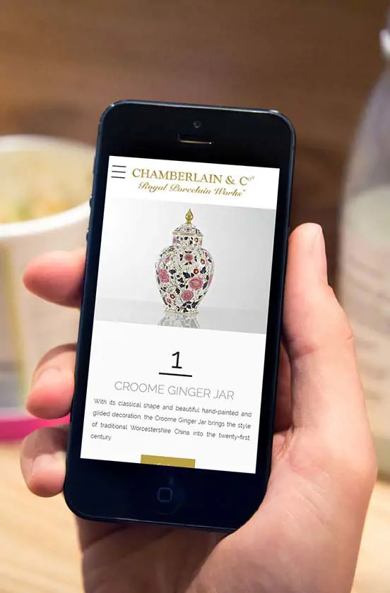
The website navigation and structures are designed to be very dynamic and allow for growth of the product ranges. A small amount of parallax effects add just enough finesse to the website without being a nuisance or too slow to use. The website is fully responsive and works perfectly on mobile and tablet devices.
This beautifully designed website coupled with the latest version of our CMS is set to go from strength to strength.
Ready to talk?
Impressed by what you have seen, want to know more? Perhaps you would like to meet in person... coffee is on us!
Get in touch